I decided to switch up my brand design starting by creating a new logo. I wasn't happy with how hard it was to create design around my old branding and logo so I wanted to create something that was simple, easy to adapt, change, design around and use as my design in my branding.
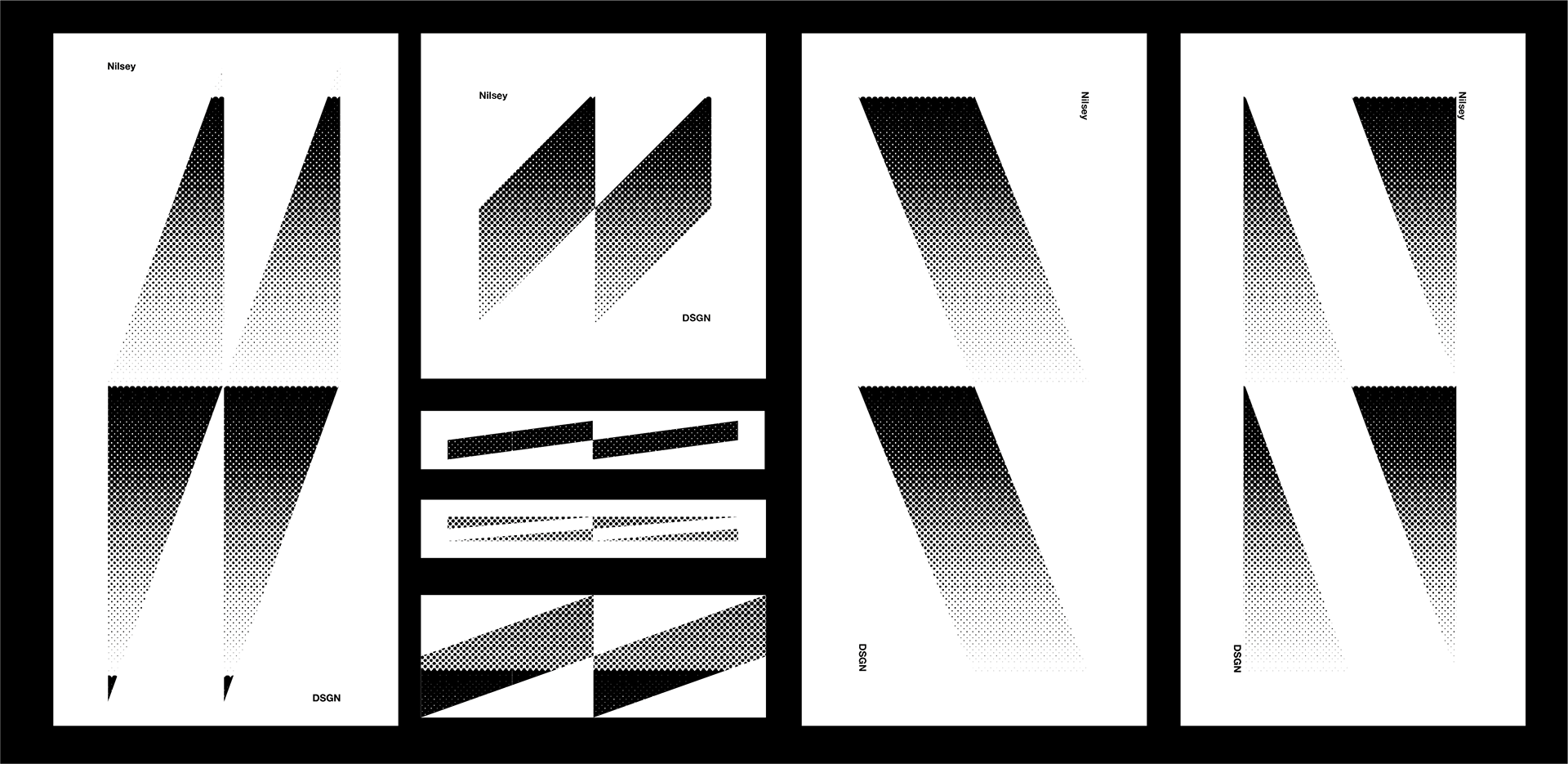
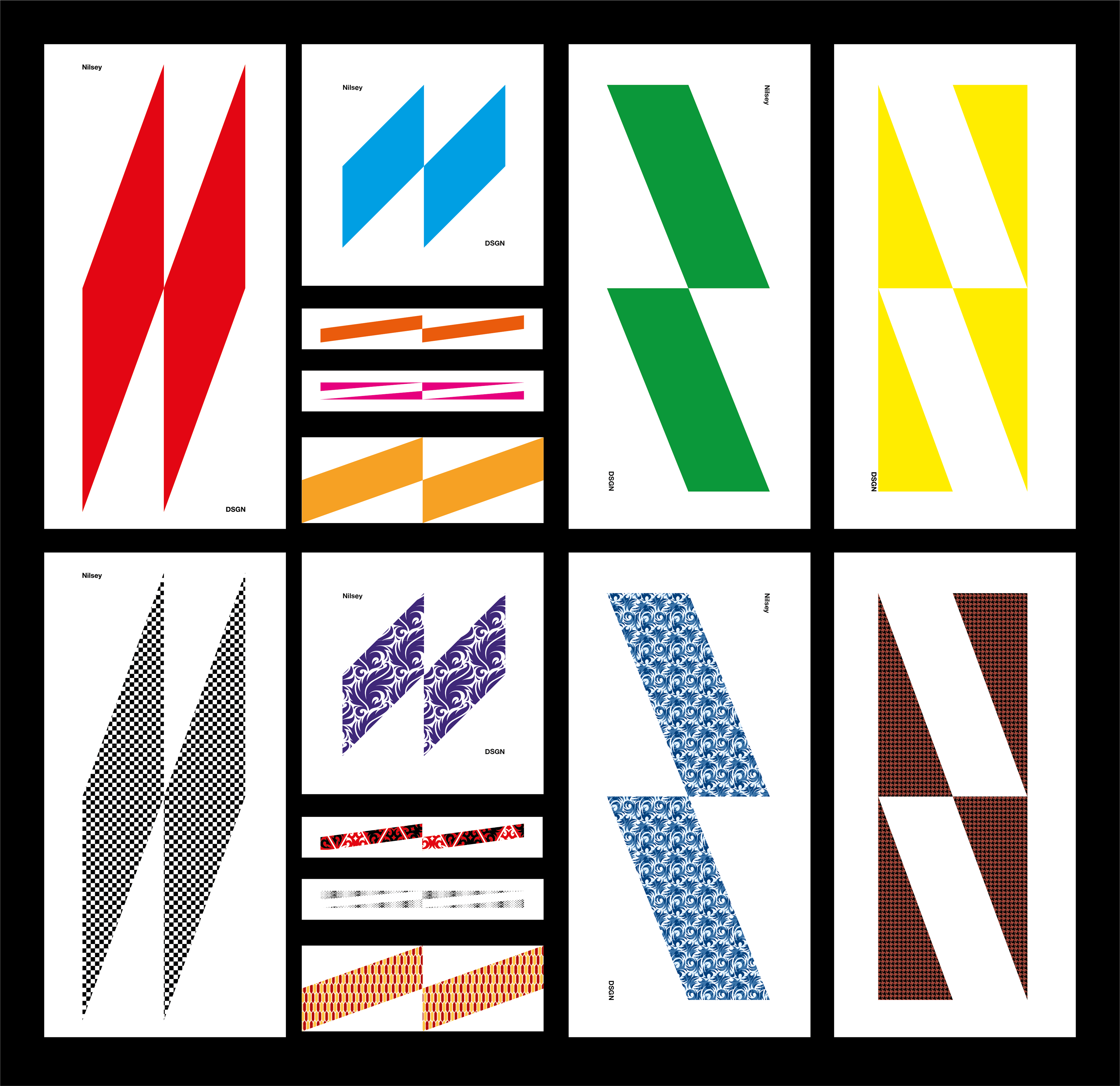
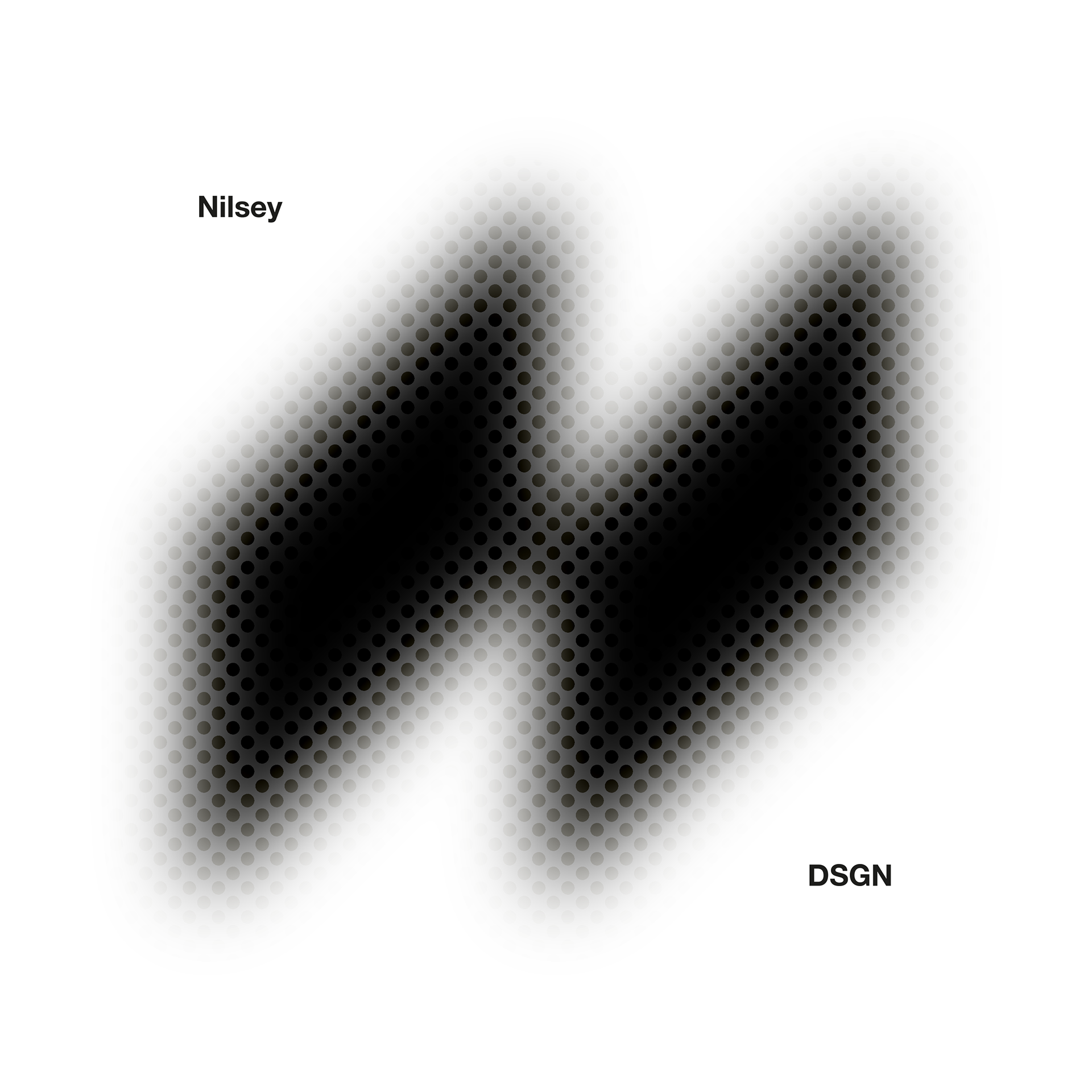
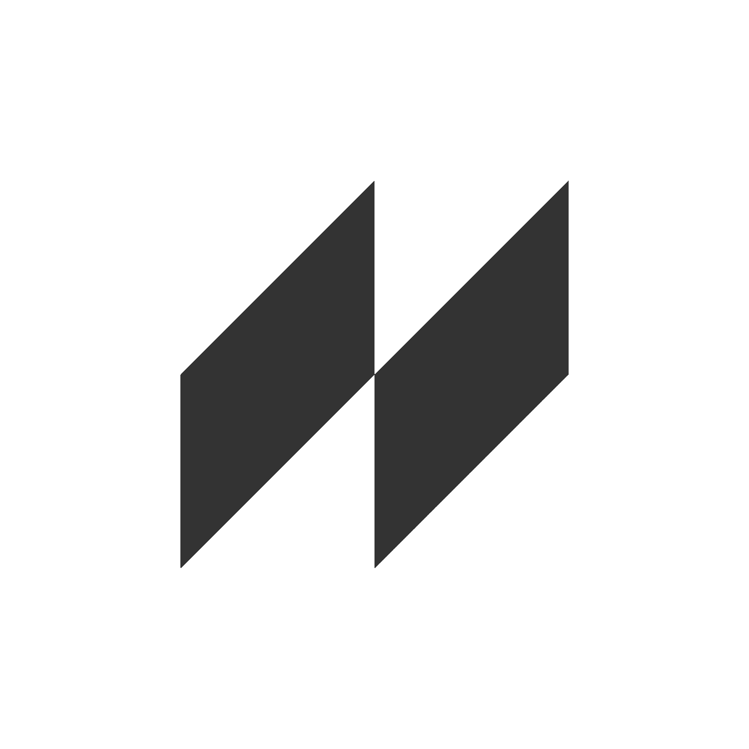
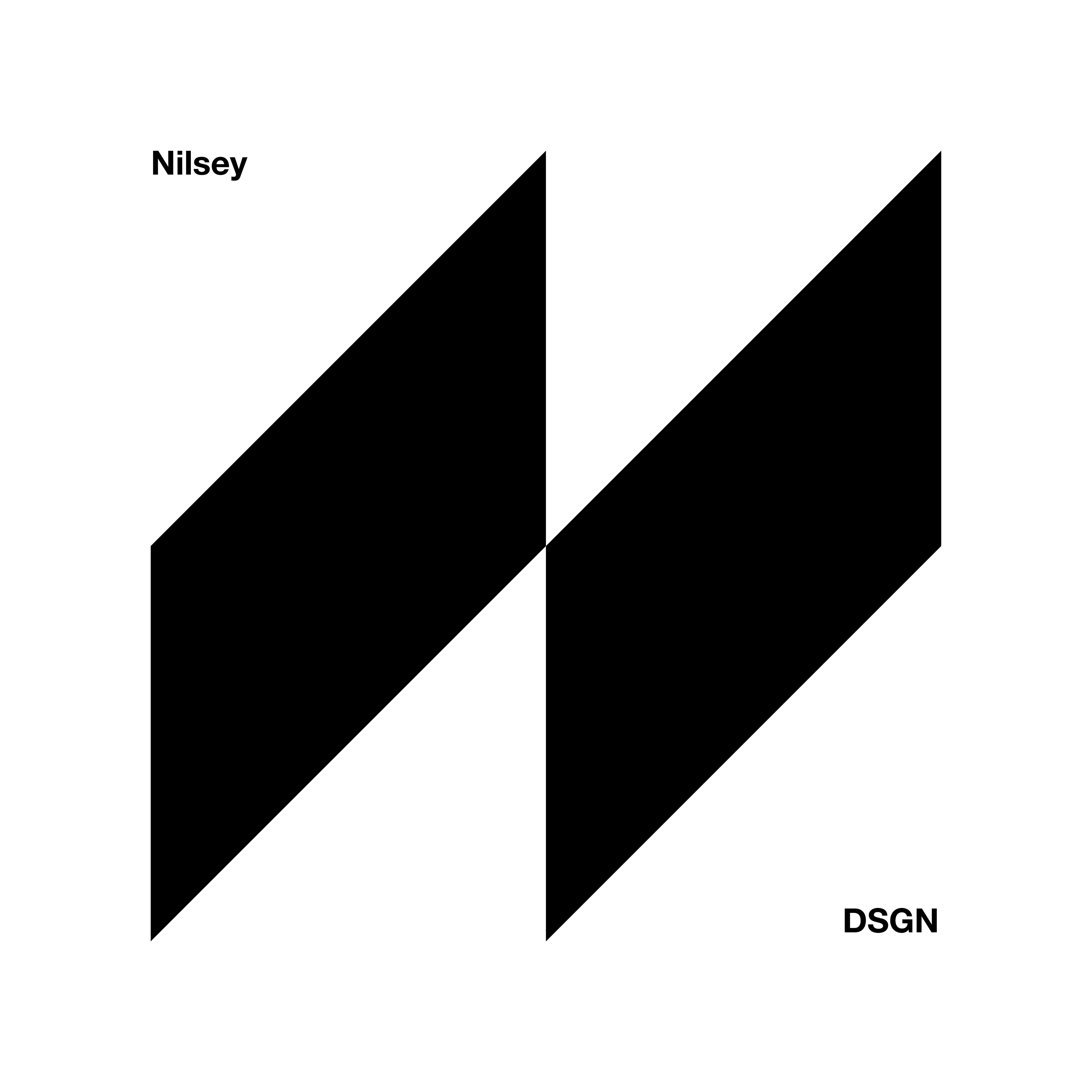
I decided on a geometric design, using two parallelogram shapes to replicate the letter 'N' for 'Nilsen', the first part of my surname.
Having my logo as a shape allows me to have lots of room to play around which I have shown in later slides. It can be squashed, stretched, multiple colours and designs and still fit with the brand. It allows me to have endless possibilities with branding and brand collateral and I think helps my brand stand out more than my previous branding.
Main logo (left) and example of how it can be used (right)
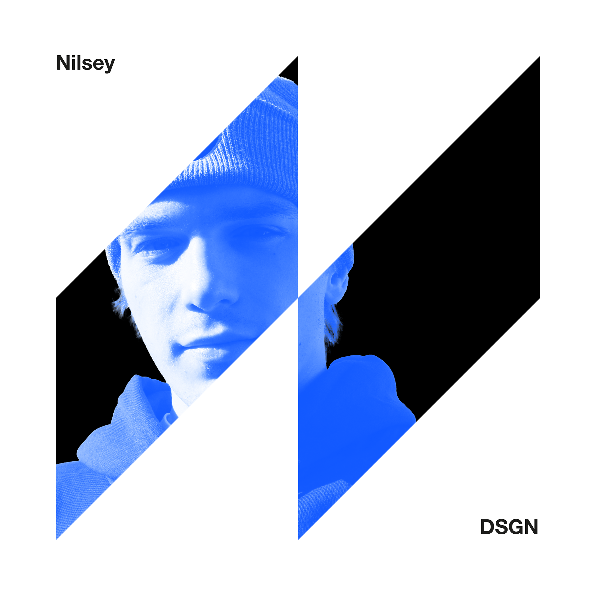


Examples of logo adaptation and experiments